No "Print Screen" key
In Windows you can press PrintScreen key in the keyboard to capture the whole screen ot Alt+PrintScreen to capture the current window. In Mac keyboard there's not such key and you have to do it using a built-in screenshot utility.
Cut-and-Paste missing in Finder
Windows Explorer equivalent in Mac is Finder. It does not have cut-and-paste functionality for file manipulation. Only thing you can do is copy-and-paste. So Cut is missing from right-click context menu and keyboard shortcuts. (Cut-and-paste IS available for clipboard operations)
No separate keys for Delete and Backspace
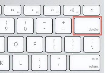
Mac keyboard has only one key for both delete and backspace functionality. You'll initially be confused by it's behaviour. The key is labeled "delete" and placed where the backspace key is on Windows keyboard. Although the key is labeled "delete", by default it has the backspace functionality. To get the the "Delete" functionality you have to use Fn+Delete.

Finder does not support the delete key for deleting files either. You have to right click and say "Move to Trash" or drag the file into Trash. No Shift+Delete is present either :-(
No option to show Hidden files
Finder doesn't provide any option to show/hide hidden system files. If you want to view hidden files you have to manually edit a configuration file using a command line utility and restart Finder process.
defaults write com.apple.finder AppleShowAllFiles TRUE
killall Finder
To stop showing hidden files again, use the same commands with the value FALSE instead of TRUE.
"Maximize" button behaviour
Maximize button in applications have different behaviour depending on the application. This is pretty confusing. The expected behaviour is fill the screen with the current window. But some applications doesn't follow this rule. Most of them just resize the window a little bit more instead of fully resizing. Safari, MS Word and Finder does this.
 iTunes will go into the compact mode when you press the Maximize button, contradicting with the '+' sign representing the icon!
Window edges cannot be used to resize windows.
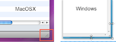
In Windows, you can use any of the four edges of a window to resize it. But in Mac, you always have to use the lower right corner of a window to resize it.

I think that should be enough for now. There maybe some more things to complain about, but I don't remember them now. Regardless of these shortcomings there are so many things to love about MacOSX! and what's my favourite operating system?? Windows 7! without a doubt!

4 comments:
I also hate Mac. Once I saw that there is a menu option like "Aireport Mode". You know what that means? Wi-Fi!
Mac interface is nonsense...
Free and open source Gnome and KDE are better... you can do whatever you like, and you can decorate as you wish... you can add menu items using scripts... and many more.
There is a print screen method. Its Fn+Shift + F3 or something. I took shots using that when I used the Hackintosh in my PC.
You know that cmd+shift+3 is the Mac equivalent to Print screen and cmd+shift+4 is an even better tool that lets you select what you want to capture. The point here is it's an equivalent. Just because something is different doesn't mean it's not there, just because you don't like it. Everything you mentioned on your post is possible and FYI, AirPort mode is the name of one of their products (which is also built into many mac products) and is not the same as Wi-Fi! God! Noobs!
Sorry for the late reply (but I haven't been moderating the blog for months).
ශාකුන්තල: Free and open source software are great but they represent an extreme end of modularity and flexibility. What is needed is a middle ground which keeps a balance of everything.
@Tharaka: Thanks for the tip.
Pwner: Thanks for the tip and I agree, I AM a Noob on Mac! But you haven't addressed fundamental design issues I've mentioned. Inconsistency of Maximize button, Show hidden files, Delete/Backspace keys...
Ps. My point is not declaring a BEST OS here since it all comes down to personal preference and annoyances. Nothing is perfect.
Post a Comment